Okay, I promise this is the last time I will mention this silly video. I finally have the full video hosted on my own site, and it is large enough to actually see what is going on. If you are still interested you can check it out here.
Showing posts with label hdr demo. Show all posts
Showing posts with label hdr demo. Show all posts
Sunday, December 2, 2007

Sunday, November 25, 2007
oh no, you don't expect me to watch this...
EDIT - Okay, I finally got these on YouTube, but I had to break them up into three parts. Its still the same crappy video, but at least you might be able to see it larger...
the quality may not be up to snuff but hey, its my first time.
EDIT - i realize my voice is simply horrible and i say 'uh' like its going out of style, and at nearly 20 MINUTES this is almost unwatchable. wow, now i see why those NAPP folks get the big $$$.
Saturday, November 10, 2007
Demo - Part IV
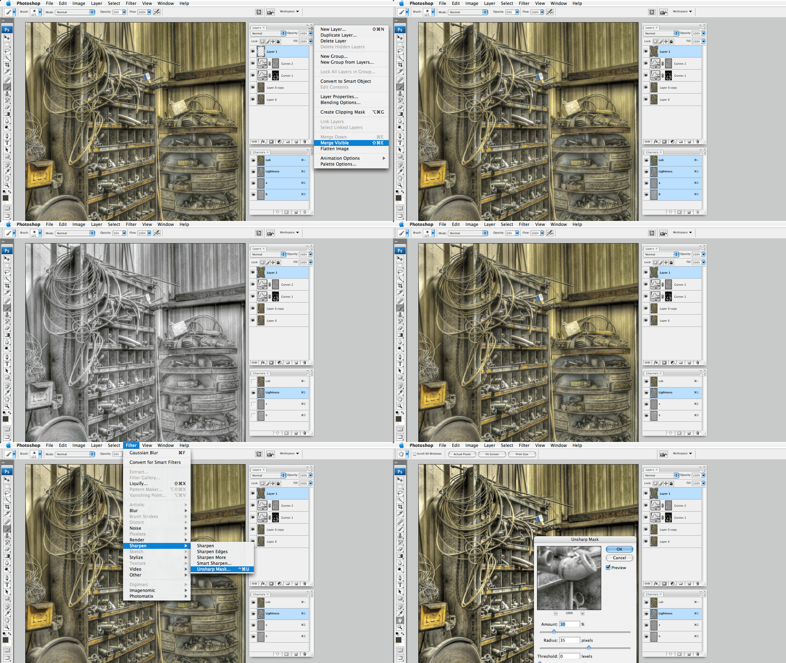

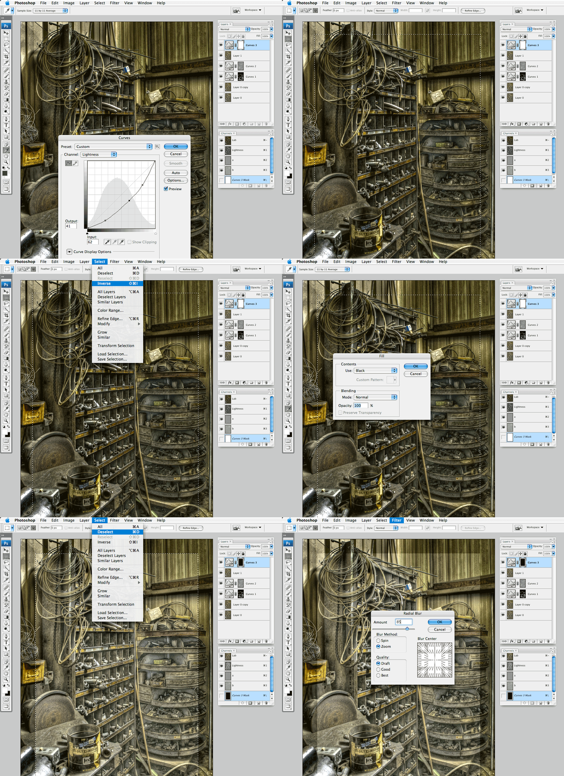
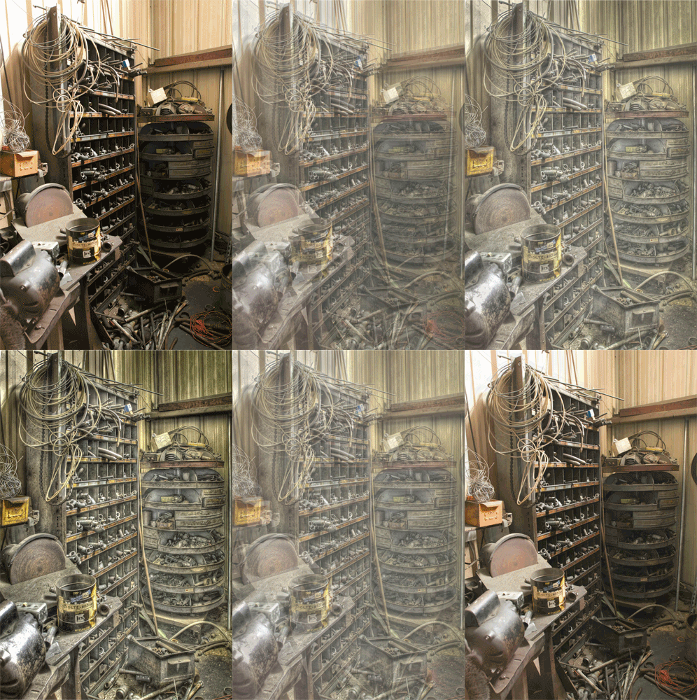
Saturday, November 3, 2007
Demo - Part III
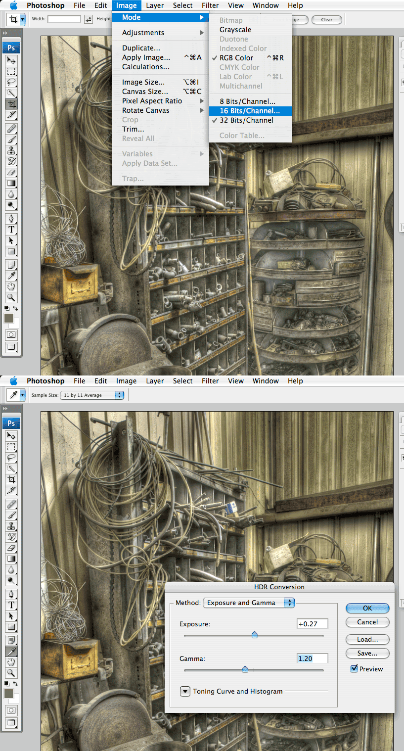

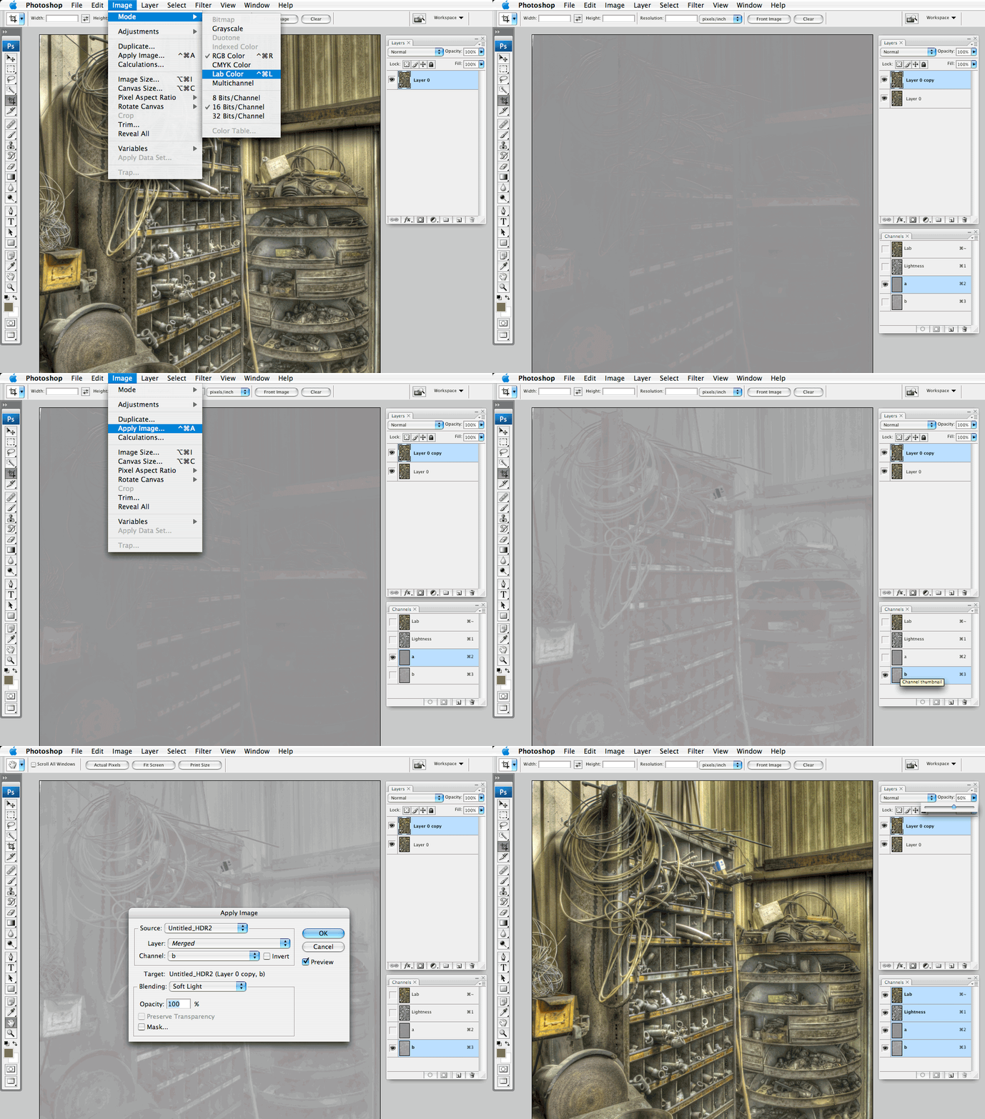
 Well, I should have included this step in with the last post. We left off with a tone mapped 32 bit image. Thats great but Photoshop wont really let you do anything within 32 bit space so we need to take this down to 16 bits per channel. Click on Image > Mode > 16 Bits/Channel. In the resulting dialog use the Exposure and Gamma Method. I would recommend leaving Exposure set to 0 and Gamma to 1.2. These are the defaults and should preserve the appearance of your tone mapped image, but you can make adjustments here if the image merits it. Click okay and the image will be down sampled to 16 bits.
Now we can do things like correct the perspective. In this case I selected Filter > Distort > Lens Correction. I adjusted the Vertical Perspective +35 to make the verticals mostly parallel.
Now we move into my favorite part, LAB color space. Select Image > Mode > Lab Color. You wont notice a change unless your channels pallet is open (if it isn't, I suggest you open it now along with the layers pallet). We then make a duplicate of the layer. So far, so good - now we get tricky. With the copy layer active target the a channel by clicking on it in the channels pallet. Now select Image > Apply Image. In the resulting dialog make sure the target is the "a" channel and change the blend mode to Soft Light. You should see the image become more contrasty. Click OK then target the "b" channel and repeat the Apply image command making sure the target is now the "b" channel and the blend mode is set to Soft Light. Now select the composite Lab channel in the channels pallet and notice that the image is super colorful and saturated. Adjust the opacity of the copied layer in the layers pallet until you are satisfied with the color saturation.
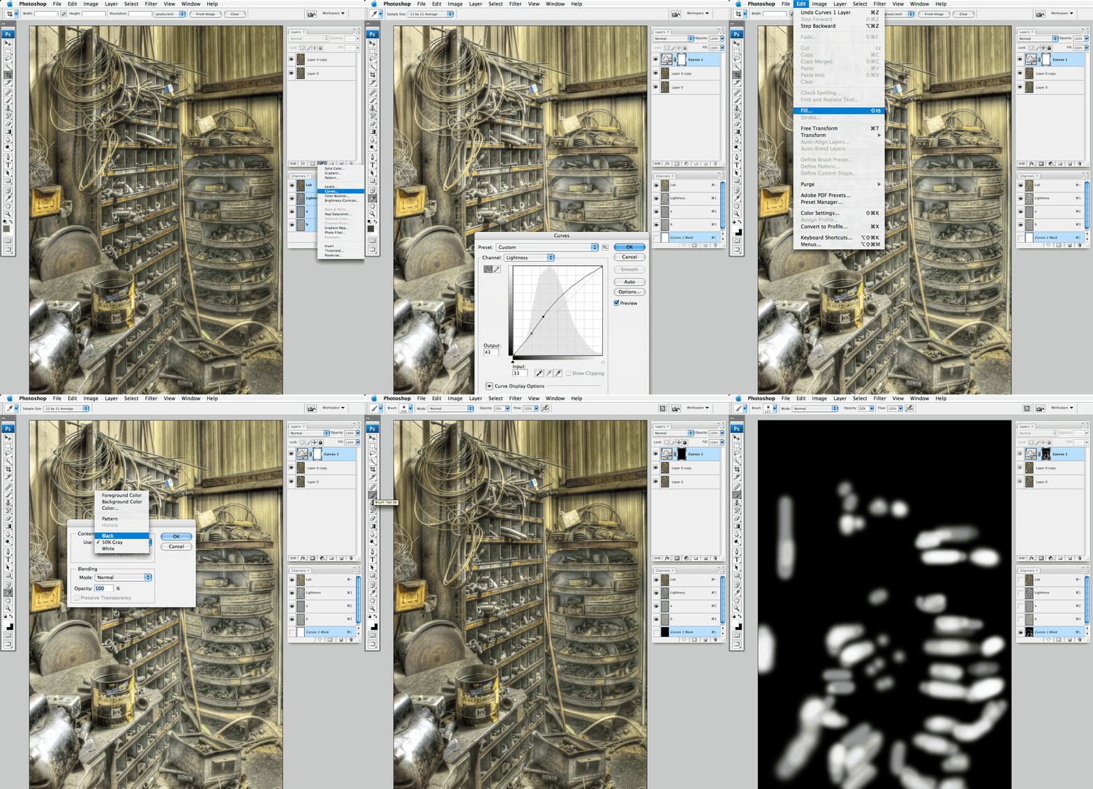
Next we make a curves adjustment layer that brightens the entire image and reveals more shadow detail. I don't really want to brighten the whole image so I fill the adjustment layer mask with black to hide the effect. Now to reveal the effect in the shadows I select a small paint brush with a soft edge, make sure my foreground color is white, and begin to paint onto the mask where I want the adjustment to be seen. Continue painting in the effect until satisfied and remember that we can always adjust the opacity of the adjustment layer if the effect is too harsh.
Finally we make another curves adjustment layer, but this one is set to sort of flatten the contrast. We raise the mid tones while forcing the shadows and highlights to their original positions. Again, I don't want this to affect the entire image so we will use another mask. With the layer mask active, make sure the foreground color is white, background black, then select Filter > Render > Clouds. You should see the layer mask turn a mottled black and white, but it is still too harsh. To smooth it out we select Filter > Blur > Gaussian Blur and use a fairly high radius (this is dependent on the image resolution). Again, the effect is still too much so we lessen it by lowering the opacity of the adjustment layer.
I think this is enough for now. Next week we will tie it all together with some super cool sharpening tricks...
Saturday, October 27, 2007
Demo - Part II
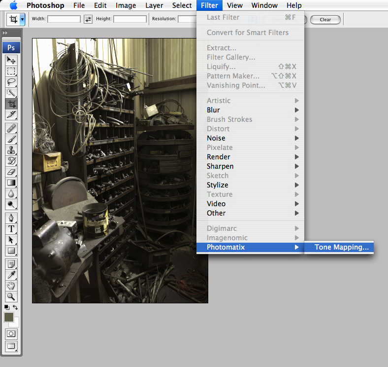
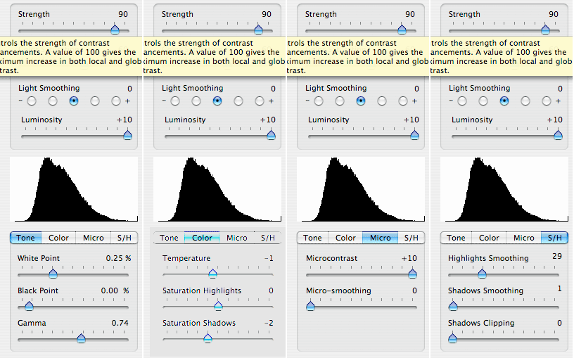
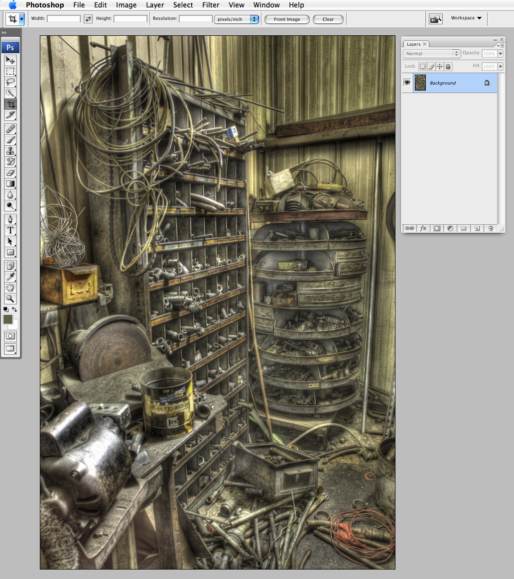 Okay. So we left off telling Photoshop to merge our selected files into one HDR image. Depending on how many frames you selected, your computer may churn for a while, but eventually you should have a 32 bit image open and ready to be tone mapped, that is what we have here. To access the Photomatix plug-in go to Filter> Photomatix> Tone Mapping.
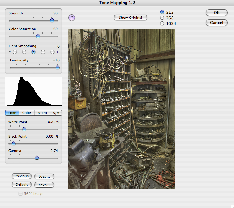
The resulting dialog can be intimidating. I've found some settings that work for me, but the best thing you can do is play around with all of the sliders until you get a feel for what they do. I recommend starting with very conservative movements. You'll quickly realize that a slight slider shift can produce radical changes.
TO THE SLIDERS....
Strength - From what I can tell, this seems to affect the intensity of each adjustment.
Color Saturation - Pretty self explanatory. I like a medium setting so I can have more flexibility later on.
Light Smoothing - This is where it starts to get weird. Higher settings look more natural, while lower setting can cause strange halos. I usually use the middle radio button, but it really depends on the image.
Luminosity - This controls the overall brightness, but higher settings can introduce unwanted image noise.
The Histogram is your friend. Pay attention to whats going on in the histogram while you adjust the various controls. Try not to clip any shadows or highlights.
The last panel has many controls to fine tune your image.
Tone - This panel has familiar White Point, Black Point and Gamma controls (think Levels).
Color - Lets you adjust overall color temperature and also highlight and shadow saturation (very nice for creative effects).
Micro - I really have no way of describing this other than "Hell Yeah!" I prefer maximum Microcontrast and minimum Micro-smoothing. The effect is like nothing I have seen before, but can introduce more of that dreaded image noise. Ease off a bit on each slider to help with the noise.
S/H - New to the latest release of the software, includes separate highlight and shadow smoothing options (use in small quantities because I think they tend to flatten out the image) and shadow clipping. Why would you want to clip shadows?
Click OK once you're tired of fumbling around, or you have run out of hair to pull out and you should have something that looks a whole lot cooler than what you started with. But we're not done yet... More in a few.
Tuesday, October 23, 2007
Demo (Redux)
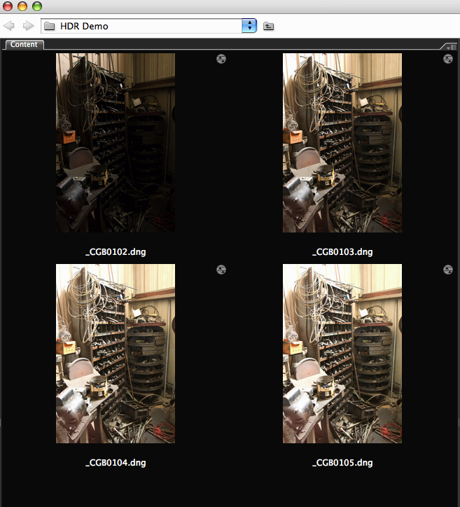
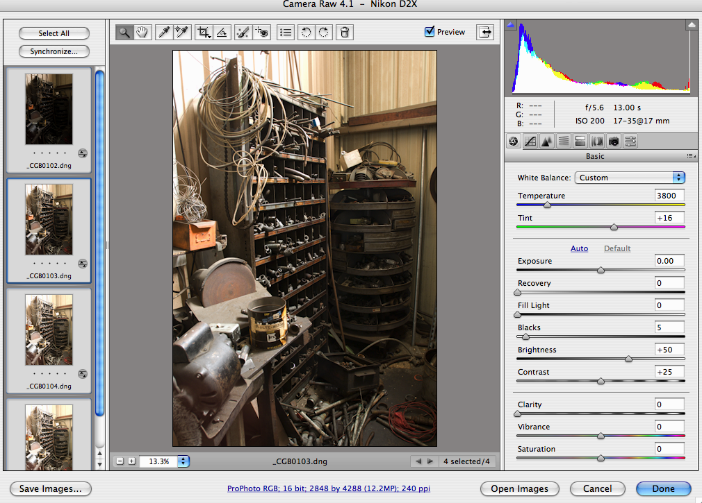

Alright. I was asked to go into a little more detail about how I work HDR images, specifically, the contest winner. Let me start by saying that if you really want a good HDR demo you should check out the one by Trey Ratcliff over at Stuck In Customs. Trey's the master at this stuff and he does a great job of explaining it. That being said I think I'll give this a shot. Let me also say that this is going to take some time to put together so expect this to come in several installments (plus this gives me an excuse for blog posts).
So I guess the first step is to shoot your scene with a minimum of three differently exposed frames. I typically set the camera to aperture priority and use auto bracketing in one stop increments. I have become accustomed to setting a seven shot bracket, but I rarely end up using all seven frames. For most scenes three frames is enough, while five frames works for the more contrasty scenes. It all depends, I like having the extra frames just in case. Whats most important is that you have enough exposure variance to cover the full dynamic range so that at least one of your frames has no highlight or shadow clipping. In this example I ended up using four frames. I think a tripod is a must (although I have seen claims of handheld), and a cable release helps. Also, I like to shoot with mirror lock-up to help reduce camera shake. Oh, I also like to focus manually and turn off auto focus to make sure there is no variance between frames.
Now on to the post... Once the images are downloaded I do a quick conversion to DNG (not required, but I really think DNG is the way to go for raw files). This is where I differ from most other tutorials I have seen. Now I can adjust the raw files in Bridge CS3 using ACR 4. The controls in ACR 4 are simply phenomenal, but make sure you apply the same settings to each file. Once done I click okay, then its back to Bridge where I do a select all then go to Tools>Photoshop>Merge to HDR. I think this is enough for now. More in a few days.
Wednesday, October 10, 2007
HDR fun

This week I did some shooting at White Point in San Pedro. I was really looking for some tide pools but this is what I ended up with. I almost always shoot for HDR these days (at least when it involves the outdoors) even if I end up using a single file for the final image. I was recently asked to post a sample of my HDR source files so I thought these would be interesting. I usually shoot in aperture priority mode with a seven frame bracket - one normal exposure, three over, three under, in one stop increments. This is the normal exposure from the auto brackets.

I then use Photoshop CS3 to combine the seven files into one HDR 32 bit file. I really like the way CS3 handles the image alignment. That file is then saved in the EXR format. There is no way to display that 32 bit file in a web browser, but this is sort of what it looks like.

Now here is where the magic happens. The EXR file gets opened in an app called Photomatix. I am tempted to post a screen shot of the interface, but it wouldn't translate well in such a small format, but just trust me when I say that Photomatix has some awesome pixel pushing power. After tone mapping is applied, the resulting file gets converted to 16 bits and saved as a TIF. This is what the file looks like at that stage. BTW- there is a Photomatix plug-in for Photoshop that might eliminate the need to jump from app to app, but I have yet to get it to work as well as the stand alone.

The TIF file is then opened in Photoshop where I do some clean up work, especially in shots like this where I need to remove some motion artifacts in the water. Then there is the usual treatment involving adjustment layers, some USM and my favorite new picture postcard trick I learned from Mr. Margulis (more on that in the future). After all that, this is what I end up with. Is it all worth the effort, I'm not sure yet, but its been a lot of fun.
Subscribe to:
Posts (Atom)